Introduction
Incomplete reporting of epidemiological data at recent times can result in case count data that is right-truncated. Right-truncated case counts can be misleading to interpret at face-value, as they will typically show a decline in the number of reported observations in the most recent time points. These are the time points where the highest proportion of the data has yet to be observed in the dataset.
The imputation of the cases that will eventually be observed up until the current time is referred to as a nowcast.
A number of methods have been developed to nowcast epidemiological case count data.
The purpose of baselinenowcast is to provide a nowcast computed directly from the most recent observations to estimate a delay distribution empirically, and apply that to the partially observed data to generate a nowcast.
In the below section, we will describe an example of a nowcasting problem, and demonstrate how to use the baselinenowcast() function to estimate a delay distribution from the data and apply that estimate to generate a probabilistic nowcast.
This function chains together a series of nowcasting steps.
For an example that walks through the low-level functionality applied to this same epidemiological question, see the modular workflow vignette.
In future vignettes, we will demonstrate examples of how to create more complex model permutations.
More details on the mathematical methods are provided in the mathematical model vignette.
Packages
As well as the baselinenowcast package this vignette also uses epinowcast, ggplot2, tidyr, and dplyr.
For baselinenowcast, see the installation instructions.
Code
knitr::opts_chunk$set(
  collapse = TRUE,
  comment = "#>"
)
library(baselinenowcast)
library(ggplot2)
library(dplyr)
library(tidyr)
Data
Nowcasting of right-truncated case counts involves the estimation of reporting delays for recently reported data. For this, we need case counts indexed both by when they were diagnosed (often called the “reference date”) and by when they were reported (i.e. when administratively recorded via public health surveillance; often called “report date”). The difference between the reference date and the report date is the reporting delay. For this quick start, we use daily level data from the Robert Koch Institute via the Germany Nowcasting hub. These data represent hospital admission counts by date of positive test and date of test report in Germany up to October 1, 2021.
We will filter the data to just look at the national-level data, for all age groups.
We will pretend that we are making a nowcast as of August 1, 2021, therefore we will exclude all reference dates and report dates from before that date.
germany_covid19_hosp is provided as package data, see ?germany_covid19_hosp for details.
In this example, we will focus on the cases for all of Germany (“DE”) summed across all age groups (“00+”).
We’ll start by preparing the data for nowcasting and evaluation by removing all reference dates beyond the nowcast date and report dates beyond the date we will use to evaluate our nowcast performance.
Code
nowcast_date <- "2021-08-01"
eval_date <- "2021-10-01"

target_data <- filter(
  germany_covid19_hosp,
  location == "DE", age_group == "00+",
  report_date <= eval_date,
  reference_date <= nowcast_date
)
Next we can plot both the “initial reports” by taking the sum of the cases at each reference date excluding all reports after the nowcast date, and compare that to what we will eventually observe as of the latest date in the complete dataset (data available through October 1, 2021). Let’s first take the sum of the cases at each reference date from the complete dataset, which represents the “final” case counts using the data available through October 1, 2021.
Next, let’s get a dataset of what we would have had available as of the nowcast date, which we obtain by excluding all report dates after the nowcast date.
Code
observed_data <- filter(
  target_data,
  report_date <= nowcast_date
)

head(observed_data)
#> # A tibble: 6 × 6
#>   reference_date location age_group delay count report_date
#>   <date>         <chr>    <chr>     <int> <dbl> <date>
#> 1 2021-04-06     DE       00+           0   149 2021-04-06
#> 2 2021-04-06     DE       00+           1   140 2021-04-07
#> 3 2021-04-06     DE       00+           2    61 2021-04-08
#> 4 2021-04-06     DE       00+           3    52 2021-04-09
#> 5 2021-04-06     DE       00+           4    36 2021-04-10
#> 6 2021-04-06     DE       00+           5     8 2021-04-11
We refer to the “initial reports” as the sum of the cases at each reference date as they were available as of the nowcast date.
Code
We will make a plot comparing the initial reports to the later observed final number of confirmed cases at each reference date.
Click to expand code to create the plot of the latest data
Code
plot_data <- ggplot() +
  geom_line(
    data = initial_reports,
    aes(x = reference_date, y = initial_count), color = "darkred"
  ) +
  geom_line(
    data = latest_data,
    aes(x = reference_date, y = final_count), color = "black"
  ) +
  theme_bw() +
  xlab("Reference date") +
  ylab("Confirmed admissions") +
  scale_y_continuous(trans = "log10") +
  ggtitle("Comparing initially reported and later observed cases")
Code
plot_data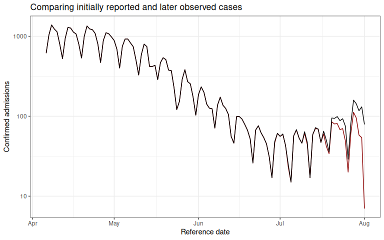
The red line shows the total number of confirmed admissions on each reference date, across all delays, using the data available as of August 1, 2021. It demonstrates the characteristic behaviour of right-truncation. This is because we have not yet observed the data with longer delays at recent time points. The black line shows the total number of confirmed admissions on each reference date as of October 1, 2021.
Our task will be to estimate, from the data available up until August 1, 2021, the “final” number of cases at each reference date.
Pre-processing
In order to compute a nowcast for this data, we will need to start by creating what we call a reporting triangle. See the nomenclature vignette for more details on the structure and naming of different components used in the package.
The entries in the reporting triangle represent the number of new cases assigned to that reference time point with a particular delay, with entries in the bottom right of the triangle missing as the data reported with longer delays has yet to be observed for recent reference times. The reporting triangle will be used to estimate the delay distribution, or the proportion of the final number of cases reported on a particular delay.
In this example, we will both fit our delay distribution, and apply it to generate a nowcast matrix using the same data, the national level data from Germany for all age groups.
We recommend choosing the maximum delay and number of historical observations based on an exploratory data analysis, as these specifications will change significantly depending on the dataset. See the NSSP nowcast for an example of an exploratory data analysis used to identify the maximum delay. Here we will set the maximum delay to 30 days.
Empirical data outside this delay window will not be used for training.
Code
max_delay <- 30Next, we will specify the amount of training volume used to fit the model as a function of the maximum delay, and the proportion of the total training volume used for delay estimation (with the remainder being used for uncertainty estimation).
Internally within baselinenowcast() we will call, allocate_reference_times() with these arguments.
We’ll us the default settings for this function here, which uses 3 times the maximum delay for the total training volume with 50% used for delay estimation.
Code
scale_factor <- 3
prop_delay <- 0.5
Next we obtain a reporting_triangle using the as_reporting_triangle() function, which expects a data.frame with case counts indexed by reference date and report date.
This function computes the delay between the reference and report date and pivots the data from long to wide, so that the rows are reference times and the columns indicate the delay between the reference and report date, and the entries indicate the incident case counts.
This also validates that the data is in the correct format and runs pre-processing to fill in any missing dates, see ?as_reporting_triangle.data.frame and ?reporting_triangle for more details on required inputs and the format of the reporting_triangle object.
Code
rep_tri_full <- as_reporting_triangle(observed_data)
#> ℹ Using max_delay = 40 from data
Let’s look at the reporting triangle object we’ve created:
Code
rep_tri_full
#> Reporting Triangle
#> Delays unit: days
#> Reference dates: 2021-04-06 to 2021-08-01
#> Max delay: 40
#> Structure: 1
#>
#> Showing last 10 of 118 rows
#> Showing first 10 of 41 columns
#>
#>             0  1  2  3  4  5  6  7  8  9
#> 2021-07-23 30 12  4  1 10  6  0  2  2  1
#> 2021-07-24 31  8  4  9  8  2  5  2  1 NA
#> 2021-07-25  8  4 14  8  6  5  1  3 NA NA
#> 2021-07-26  9  6  2  3  0  0  0 NA NA NA
#> 2021-07-27 35 11  6  4  4  1 NA NA NA NA
#> 2021-07-28 51 28 25  3  5 NA NA NA NA NA
#> 2021-07-29 47 37  9  2 NA NA NA NA NA NA
#> 2021-07-30 36 20  2 NA NA NA NA NA NA NA
#> 2021-07-31 38 16 NA NA NA NA NA NA NA NA
#> 2021-08-01  7 NA NA NA NA NA NA NA NA NA
#>
#> Use print(x, n_rows = NULL, n_cols = NULL) to see all data
And we can get a summary of it:
Code
summary(rep_tri_full)
#> Reporting Triangle Summary
#> Dimensions: 118 x 41
#> Reference period: 2021-04-06 to 2021-08-01
#> Max delay: 40 days
#> Structure: 1
#> Most recent complete date: 2021-06-22 (67 cases)
#> Dates requiring nowcast: 40 (complete: 78)
#> Rows with negatives: 0
#> Zeros: 1278 (31.8% of non-NA values)
#> Zeros per row summary:
#>    Min. 1st Qu.  Median    Mean 3rd Qu.    Max.
#>    0.00    4.00    8.00   10.83   19.00   33.00
#>
#> Mean delay summary (complete rows):
#>    Min. 1st Qu.  Median    Mean 3rd Qu.    Max.
#>   2.525   4.857   5.650   5.469   6.174   7.678
#>
#> 99% quantile delay (complete rows):
#>    Min. 1st Qu.  Median    Mean 3rd Qu.    Max.
#>   17.00   33.00   35.00   34.31   37.00   40.00
We can see the maximum delay is set to the maximum observed delay, which in some cases will be a lot larger than the delays we want to model.
We strongly recommend using the truncate_to_delay() or truncate_to_quantile() functions to set the maximum delay in your nowcasting problem.
Choosing too large a maximum delay will mean that there is less data, or potentially insufficient data, available for estimating uncertainty from retrospective nowcast errors.
For this analysis, we want to limit our reporting triangle to a maximum delay of 30 days using truncate_to_delay():
Code
rep_tri <- truncate_to_delay(rep_tri_full, max_delay = max_delay)
#> ℹ Truncating from max_delay = 40 to 30.
Let’s check the truncated triangle:
Code
rep_tri
#> Reporting Triangle
#> Delays unit: days
#> Reference dates: 2021-04-06 to 2021-08-01
#> Max delay: 30
#> Structure: 1
#>
#> Showing last 10 of 118 rows
#> Showing first 10 of 31 columns
#>
#>             0  1  2  3  4  5  6  7  8  9
#> 2021-07-23 30 12  4  1 10  6  0  2  2  1
#> 2021-07-24 31  8  4  9  8  2  5  2  1 NA
#> 2021-07-25  8  4 14  8  6  5  1  3 NA NA
#> 2021-07-26  9  6  2  3  0  0  0 NA NA NA
#> 2021-07-27 35 11  6  4  4  1 NA NA NA NA
#> 2021-07-28 51 28 25  3  5 NA NA NA NA NA
#> 2021-07-29 47 37  9  2 NA NA NA NA NA NA
#> 2021-07-30 36 20  2 NA NA NA NA NA NA NA
#> 2021-07-31 38 16 NA NA NA NA NA NA NA NA
#> 2021-08-01  7 NA NA NA NA NA NA NA NA NA
#>
#> Use print(x, n_rows = NULL, n_cols = NULL) to see all data
Click to expand code to create the plot of the reporting triangle
Code
triangle_df <- as.data.frame(rep_tri) |>
  mutate(time = as.numeric(factor(reference_date)))

plot_triangle <- ggplot(
  triangle_df,
  aes(x = delay, y = time, fill = count)
) +
  geom_tile() +
  scale_fill_gradient(low = "white", high = "blue") +
  labs(title = "Reporting triangle", x = "Delay", y = "Time") +
  scale_y_reverse()
Code
plot_triangle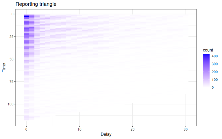 Here, the grey indicates matrix elements that are
 NA, which we would expect to be the case in the bottom right portion of the reporting triangle where the counts have yet to be observed.
Run the baselinenowcast workflow
To generate a nowcast from a reporting triangle, we can use the baselinenowcast() function.
This function chains together the following nowcasting steps:
1. Allocates the reference times (allocate_reference_times()) used for model fitting for both delay and uncertainty estimation, given the scale_factor and prop_delay as described above, with the values above also used as defaults in the absence of user specification.
2. Estimates a delay distribution from the reporting triangle (estimate_delay()), using the number of reference times allocated for delay estimation.
3. Generates a point nowcast (apply_delay()) from the reporting triangle and delay distribution.
4. Estimates the uncertainty parameters (estimate_uncertainty_retro()) using retrospective nowcast errors.
5. Sample from the uncertainty model to generate probabilistic draws of the nowcast (sample_nowcasts()).
See the documentation for each of these functions for more details on the specific workflow step, and the documentation for ?baselinenowcast.reporting_triangle for input options.
In this example, we will demonstrate how to specify the reference time allocation and the number of probabilistic draws to include, and will otherwise use the default specifications.
A point nowcast can be returned by specifying output_type = "point".
Code
nowcast_draws_df <- baselinenowcast(
  rep_tri,
  scale_factor = scale_factor,
  prop_delay = prop_delay,
  draws = 100
)
The nowcast_draws_df is a data.frame of the class baselinenowcast_df (see ?baselinenowcast_df for more details).
It contains probabilistic draws of estimate of the final number of cases on each reference date.
Visualizing the nowcast
We’ll want to compare the nowcasts to both the initial reports and the eventually observed case counts. We can join both datasets to the probabilistic nowcasts by the reference date. Join the nowcasts, data as of the nowcast date, and the final data.
Code
obs_with_nowcast_draws_df <- nowcast_draws_df |>
  left_join(latest_data, by = "reference_date") |>
  left_join(initial_reports, by = "reference_date")
head(obs_with_nowcast_draws_df)
#>   pred_count reference_date draw output_type nowcast final_count initial_count
#> 1        609     2021-04-06    1     samples   FALSE         615           615
#> 2        609     2021-04-06    2     samples   FALSE         615           615
#> 3        609     2021-04-06    3     samples   FALSE         615           615
#> 4        609     2021-04-06    4     samples   FALSE         615           615
#> 5        609     2021-04-06    5     samples   FALSE         615           615
#> 6        609     2021-04-06    6     samples   FALSE         615           615
Click to expand code to create the plot of the probabilistic nowcast
Code
combined_data <- obs_with_nowcast_draws_df |>
  select(reference_date, initial_count, final_count) |>
  distinct() |>
  pivot_longer(
    cols = c(initial_count, final_count),
    names_to = "type",
    values_to = "count"
  ) |>
  mutate(type = case_when(
    type == "initial_count" ~ "Initial reports",
    type == "final_count" ~ "Final observed data"
  ))

# Plot with draws for nowcast only
plot_prob_nowcast <- ggplot() +
  # Add nowcast draws as thin gray lines
  geom_line(
    data = obs_with_nowcast_draws_df,
    aes(
      x = reference_date, y = pred_count, group = draw,
      color = "Nowcast draw", linewidth = "Nowcast draw"
    )
  ) +
  # Add observed data and final data once
  geom_line(
    data = combined_data,
    aes(
      x = reference_date,
      y = count,
      color = type,
      linewidth = type
    )
  ) +
  theme_bw() +
  scale_color_manual(
    values = c(
      "Nowcast draw" = "gray",
      "Initial reports" = "darkred",
      "Final observed data" = "black"
    ),
    name = ""
  ) +
  scale_linewidth_manual(
    values = c(
      "Nowcast draw" = 0.2,
      "Initial reports" = 1,
      "Final observed data" = 1
    ),
    name = ""
  ) +
  scale_y_continuous(trans = "log10") +
  xlab("Reference date") +
  ylab("Hospital admissions") +
  theme(legend.position = "bottom") +
  ggtitle("Comparison of admissions as of the nowcast date, later observed counts, \n and probabilistic nowcasted counts") # nolint
Code
plot_prob_nowcast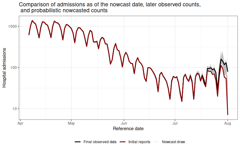 Gray lines indicate the probabilistic nowcast draws, which are a combination of the already observed data at each reference date and the predicted nowcast draws at each reference date.
Black lines show the “final” data from October 1, 2021.
Gray lines indicate the probabilistic nowcast draws, which are a combination of the already observed data at each reference date and the predicted nowcast draws at each reference date.
Black lines show the “final” data from October 1, 2021.
Summary
In this vignette we used baselinenowcast functions to generate a probabilistic nowcast from a dataframe of incident COVID-19 hospital admissions indexed by reference date and report date in Germany.
To do this, we first converted the input data to a reporting_triangle and then called the baselinenowcast() function which ran each of the steps of our nowcasting workflow.
As a final step, we compared our nowcasts of the final cases to the eventual final observed cases and the initially reported case counts.
The baselinenowcast() function also directly supports nowcasting for multiple strata and common tasks for handling multiple strata such as sharing delay and uncertainty estimates across strata.
See the documentation for ?baselinenowcast.data.frame for more details.
Alternatively, you might be interested in building a more customisable nowcasting workflow. This is supported by our modular workflow which enables a pipeline-based approach using low-level functions. For an example of walking through this same nowcasting problem using the low-level functions directly, see the modular workflow vignette.
In this vignette we use the package’s default settings to specify the model, but the optimal settings will depend on the context and its important to tune the model for your dataset and needs. The user has a number of choices in how to specify the model, such as:
- the amount of training data to use for delay or uncertainty estimation
- the choice of observation model
- how to stratify nowcasts e.g. by age group or weekday
- whether to borrow estimates from across different strata
In our publication we show examples using the various model specifications to produce and evaluate the performance of age-group specific nowcasts of COVID-19 in Germany and norovirus cases in England. Here’s a link to the code used to generate those nowcasts if interested in doing something similar for your own setting.
We encourage users to test the performance of different specifications of their model, ideally by producing nowcasts from different model specifications for a range of past nowcast dates, using the data that would have been available as of the past nowcast date, and comparing those nowcasts to later observed data.